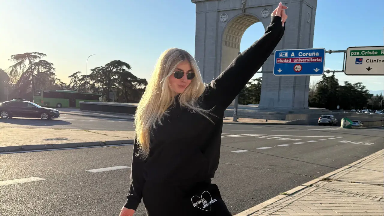
Colour Combinations That Make Hoodies Pop

Why hoodie colour combinations matter more than you think
Hoodie colour combinations decide whether an outfit looks pulled together or thrown on in a hurry. A hoodie is a big block of colour sitting right in the middle of your body, so whatever shade you pick does most of the talking. Get the pairing wrong and even a well cut hoodie can look flat against the wrong trousers or jacket. Get it right and a plain cotton hoodie can carry an entire outfit without any logos or prints doing the work.
Key takeaways
- Neutral hoodies in grey, stone or olive pair well with almost everything and work best when you vary tone rather than colour.
- Bold hoodie colours work when one piece leads and the rest of the outfit stays simple and darker in tone.
- When layering, let only one item carry strong colour at a time to avoid a busy, uncoordinated look.
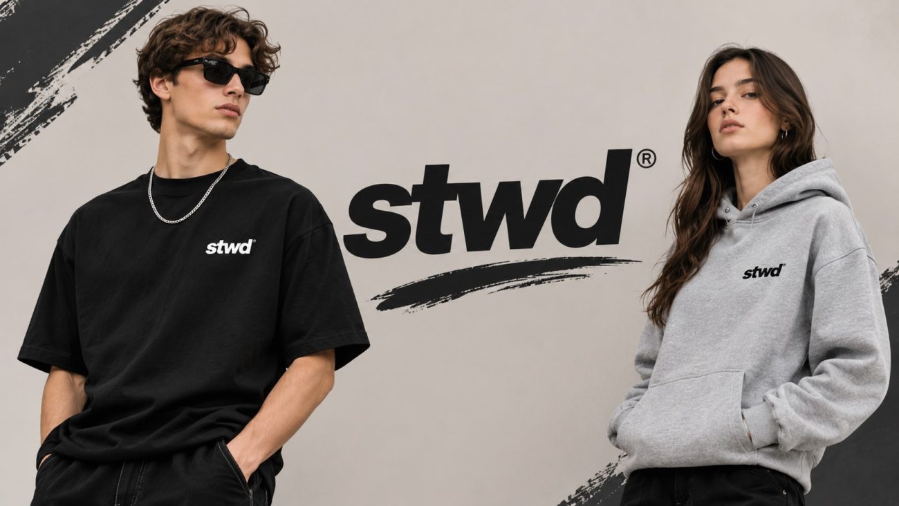
Most people default to grey, black or navy because these are safe, but safe isn’t the same as interesting. Thinking about hoodie colour combinations properly means treating the hoodie as a colour decision, not just a comfort decision. Brands such as hypedept sell hoodies in a range of shades, which gives you more to work with than the usual three staples. Once you start noticing how colours sit next to each other, you’ll find combinations that feel deliberate rather than accidental.
The rest of this piece breaks down which pairings genuinely work, how contrast changes the mood of an outfit, and where you can afford to take a risk. None of it requires buying anything new straight away. Look at what’s already in your wardrobe first, then build from there.
Neutral bases that still have personality
Neutral doesn’t have to mean boring. Grey, stone, olive and off-white hoodies all sit in the neutral family but each one reads differently next to denim, chinos or black trousers. Grey next to black is classic and slightly moody. Stone or beige against washed denim feels warmer and more relaxed, closer to off-duty than streetwear. Olive is the most forgiving of the lot because it leans slightly warm and slightly cool at once, so it sits comfortably with navy, brown, black or khaki without fighting any of them.
The trick with neutral hoodie colour combinations is varying the tone, not just the colour family. A light grey hoodie with charcoal trousers has more depth than grey on grey, because the eye reads the contrast in lightness even when the colour itself barely changes. The same goes for stone with camel or tan: close enough to feel coordinated, different enough to avoid looking like one flat shape.
If you want a single hoodie that works with almost everything you own, a mid grey or olive is the safest bet. Both pair well with black, navy, brown and most denim washes, which makes them a sensible starting point before you move on to bolder pairings.
Bold contrasts that work without looking try-hard
Strong contrast is where hoodie colour combinations get interesting, but it only works if one colour clearly leads and the other supports it. A burgundy or rust hoodie against navy trousers reads as confident rather than clashing, because both colours sit in a similar depth of tone even though they’re different hues. The same logic applies to forest green against black, or mustard against dark denim. The key is keeping one half of the outfit darker and letting the hoodie carry the brighter or warmer colour.
Black and white is the most obvious high contrast pairing, and it still works precisely because it’s simple. A white hoodie against black trousers or a black hoodie against pale denim gives a clean, almost graphic look that needs nothing else to finish it. Trainers and outerwear should stay quiet here so the contrast stays between the two main pieces.
A hypedept zip up hoodie in a strong colour like deep red or cobalt can anchor an outfit built around darker, simpler pieces elsewhere, since the zip front already breaks up the block of colour slightly and makes bold shades feel less overwhelming. Keep jewellery, caps and bags neutral when the hoodie itself is doing the loud work.
Layering colours without creating visual noise
Once a jacket, coat or gilet enters the picture, hoodie colour combinations get more complicated because you’re now balancing three colours instead of two. The simplest fix is picking a jacket in a neutral that already appears somewhere in your outfit, usually the trousers or shoes, so the eye has a logical path through the look rather than three unrelated blocks of colour.
A good rule is to let only one piece carry real colour at a time. If the hoodie is bright, the jacket and trousers should stay muted: black, grey, navy or brown. If the hoodie is neutral, that’s your chance to bring colour in through the jacket instead, or through trainers and accessories. Trying to make everything colourful at once almost always backfires, because nothing gets to stand out and the whole outfit reads as busy rather than considered.
Texture helps too. A smooth nylon jacket over a heavier cotton hoodie creates contrast even when the colours are close, which stops a monochrome outfit from feeling flat. Pay attention to how the hoodie’s colour looks under different lighting as well, since some shades that look neutral indoors turn noticeably warmer or cooler outside. Testing an outfit in daylight before committing to it saves a lot of second guessing later.
Frequently asked questions
What colour hoodie goes with everything?
A mid grey or olive hoodie is the most versatile choice because both tones pair comfortably with black, navy, brown and most denim washes. They sit between warm and cool, so they rarely clash with whatever else you’re wearing.
Can you wear a bright coloured hoodie with jeans?
Yes, as long as the jeans are a simple wash like black, dark indigo or light blue. A bright hoodie reads best when the trousers stay plain so the colour has room to stand out without competing.
How do you match a hoodie with a jacket?
Pick a jacket in a neutral that already appears in your outfit, such as the trousers or shoes, and let only one piece carry strong colour at a time. This keeps the layering coordinated rather than busy.